
The real estate market in Florianopolis has grown year after year, even in Brazilian crisis years, due to two very important factors: the first factor is the high demand of travelers in the summer who seek their beautiful landscapes and more than 40 beaches. The second factor is the expansion of the real estate market, with many new projects being launched that make 100% properties available in early access in the project, and with this, they inject to the market a money from financing these properties.
In this scenario Habiflex, which is a real estate company operating in the south of the island of Florianópolis, connects people who want to sell or rent their properties with people who looking for to rent or buy a property, whether to live or to invest, in addition to all real estate brokerage services and professional legal assistance.
Research start
Since its launch, Habiflex has several competitors in the region, all without exception having similar business models. Among these competitors, Habiflex is neither the largest nor the most popular, but it has a dedicated team and uses a lean structure as a differential.
To start my research, I started looking at the services of real estate competitors such as website, user flow, third-party tools used, keywords of pages, search funnel and filters, page code structure and ranking in the organic search of the Google for the main keywords used.
I’m not going to go into detail on all of the above, because I want to stay focused on UX research only.
Here we have the competitors:

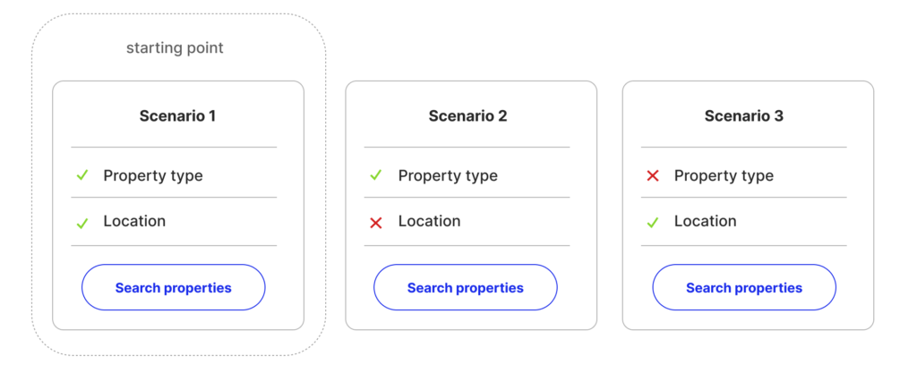
Scenario
During my research, I identified several different scenarios of use, but I grouped them into 3 groups:
- Scenario 1
The user knows the type of property he wants and already knows which neighborhood he/she wants to live in (standard scenario); - Scenario 2
The user knows the type of property he/she wants but has not yet known which neighborhood to live in; - Scenario 3
The user has not yet decided on what type of property he/she wants but knows which neighborhood he wants to live in;
Personas
In my researches, I found 5 types of people that are looking for properties, either to buy or to rent. These 5 types of people have different needs and goals. With this in mind, the idea is to chart the best flow of navigation and features for each profile. In this research, I excluded the investor profile, which I will work individually, because normally or it fits the profile of the other 4 profiles or searches for projects under construction that works in another way.
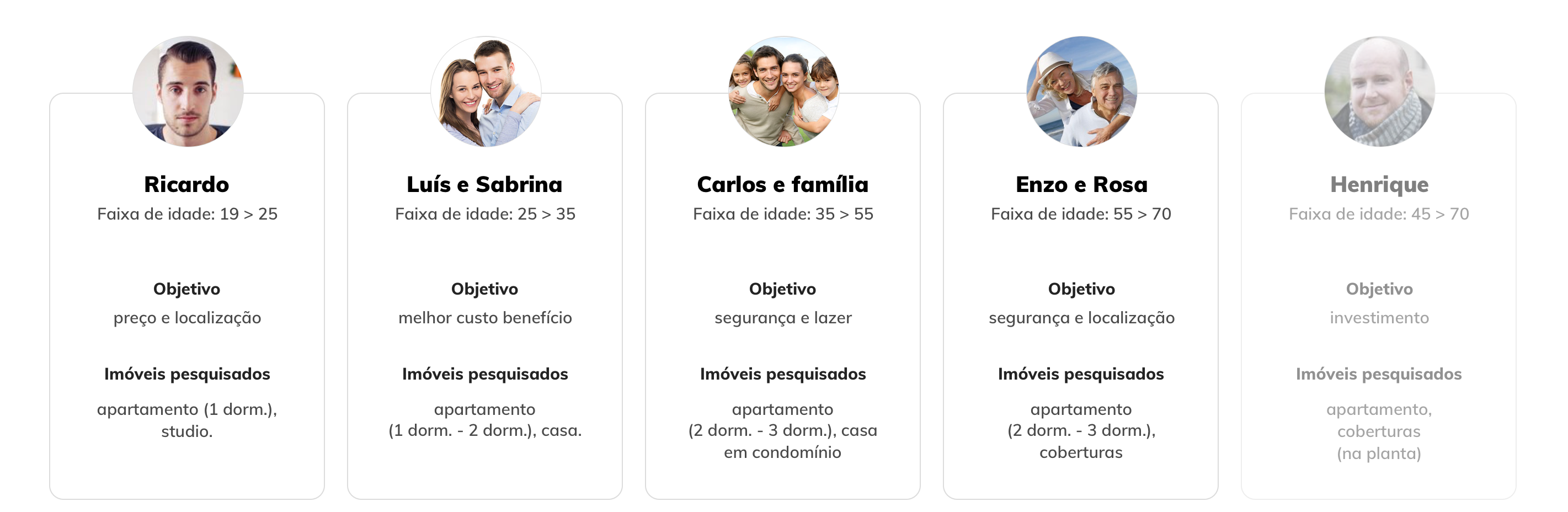
Data taken from site research, in-store customer service and lead-based mailchimp (96-user search)
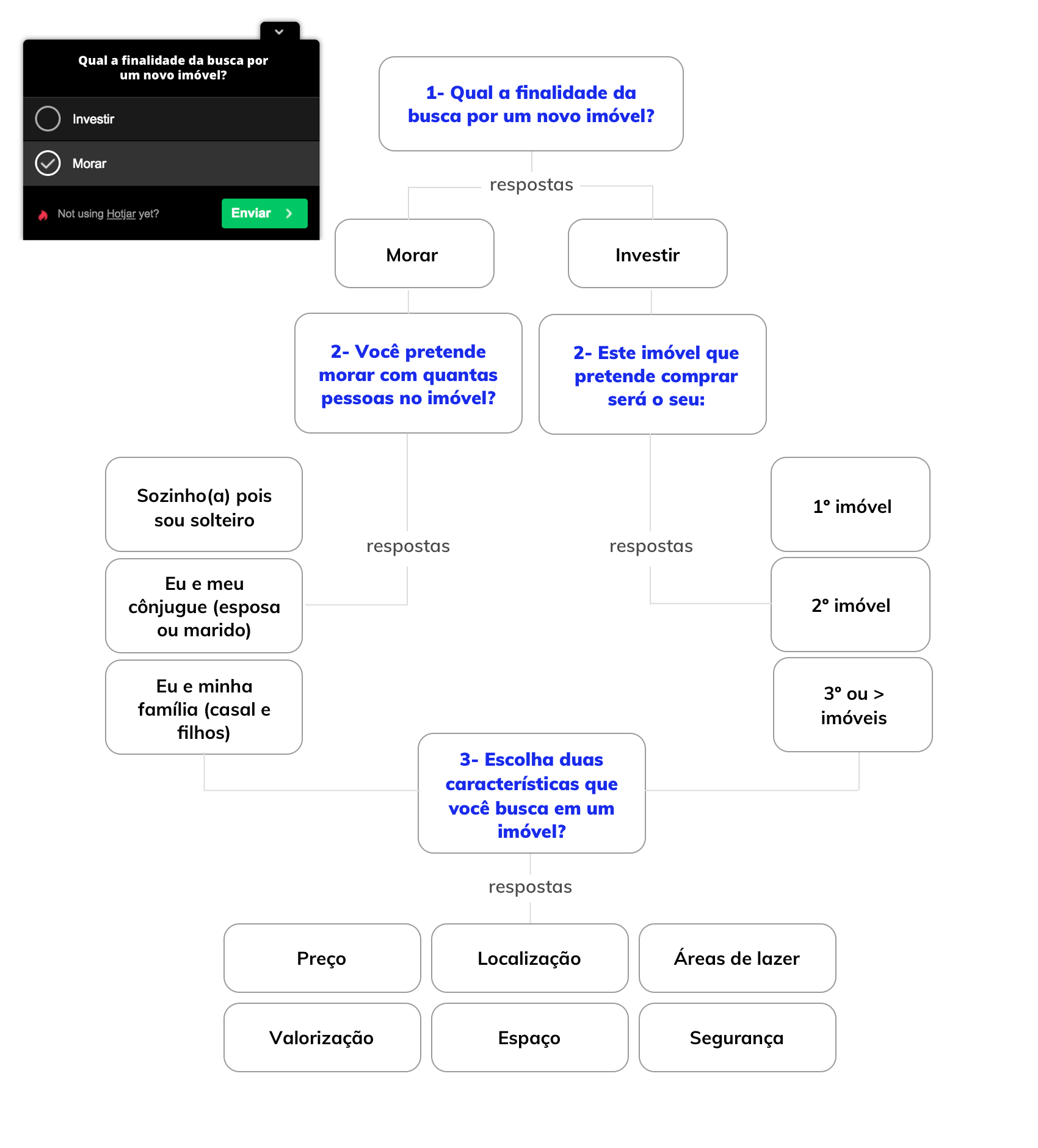
Research with users
I did three kinds of surveys with the users to identify their goals and pain when looking for a property. The first survey was conducted with a heat map on the pages, identifying which areas of the site the user uses. The second survey was conducted on the search results page using the Hotjar tool and the second was a satisfaction survey made via Mailchimp and Typeform with all users after 10 days that they contacted signaling interest in a real estate property.
1ª Survey
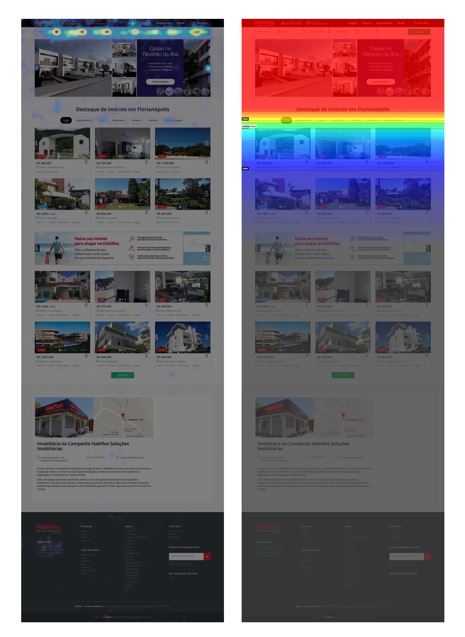
2ª Survey
3ª Survey
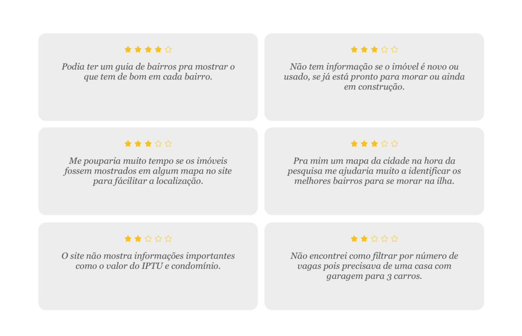
The search for satisfaction has many questions that are related to the service rendered as the waiting time between the interest in the site and the contact of the realtor, if everything went well in the service, a note to evaluate the service among other things, I go focus only on responses to the site.
Most responses on the site can be classified into 2 groups: bugs and lack of functionality.
Research Summary
I concluded that after all the researches, some points had to be worked out, among them:
- the sensation when entering the site is that the user already has to know what to look for;
- lack of location property information;
- lack of information about neighborhoods;
- the listing of properties needs to facilitate the user to find the best options for his profile and not simply show all available options.
Solution
Starting with the identified pains, I focused on trying to solve the main complaints of users by inserting new features and redesigning some features that were hidden inside the site.
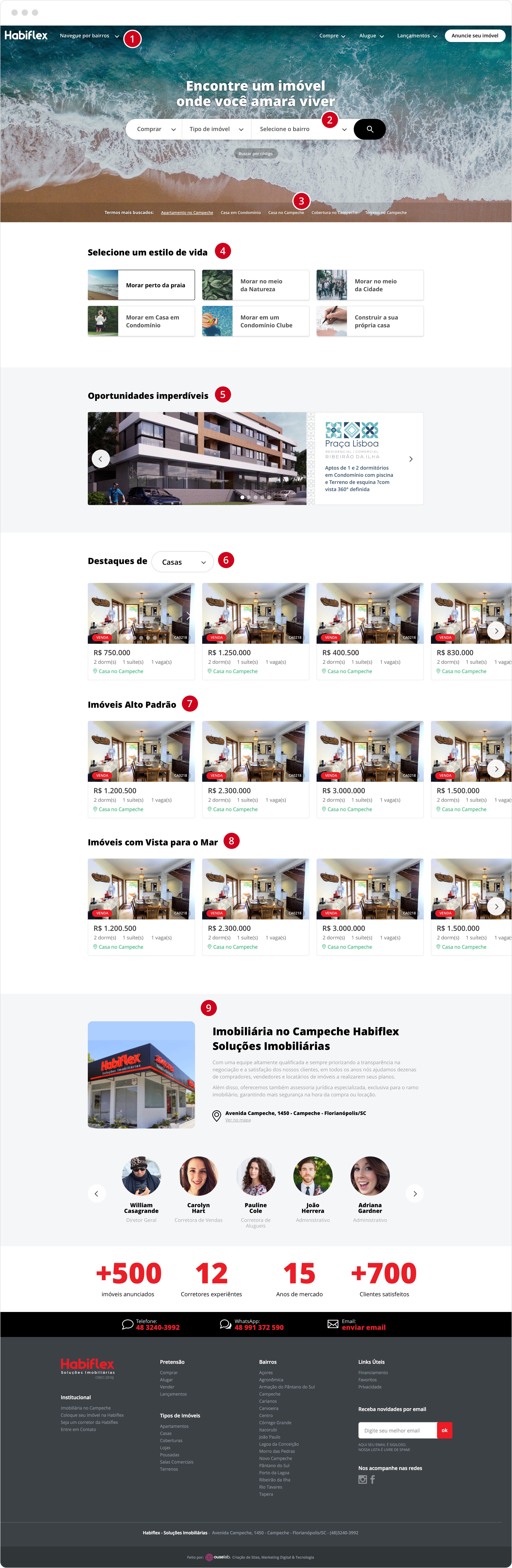
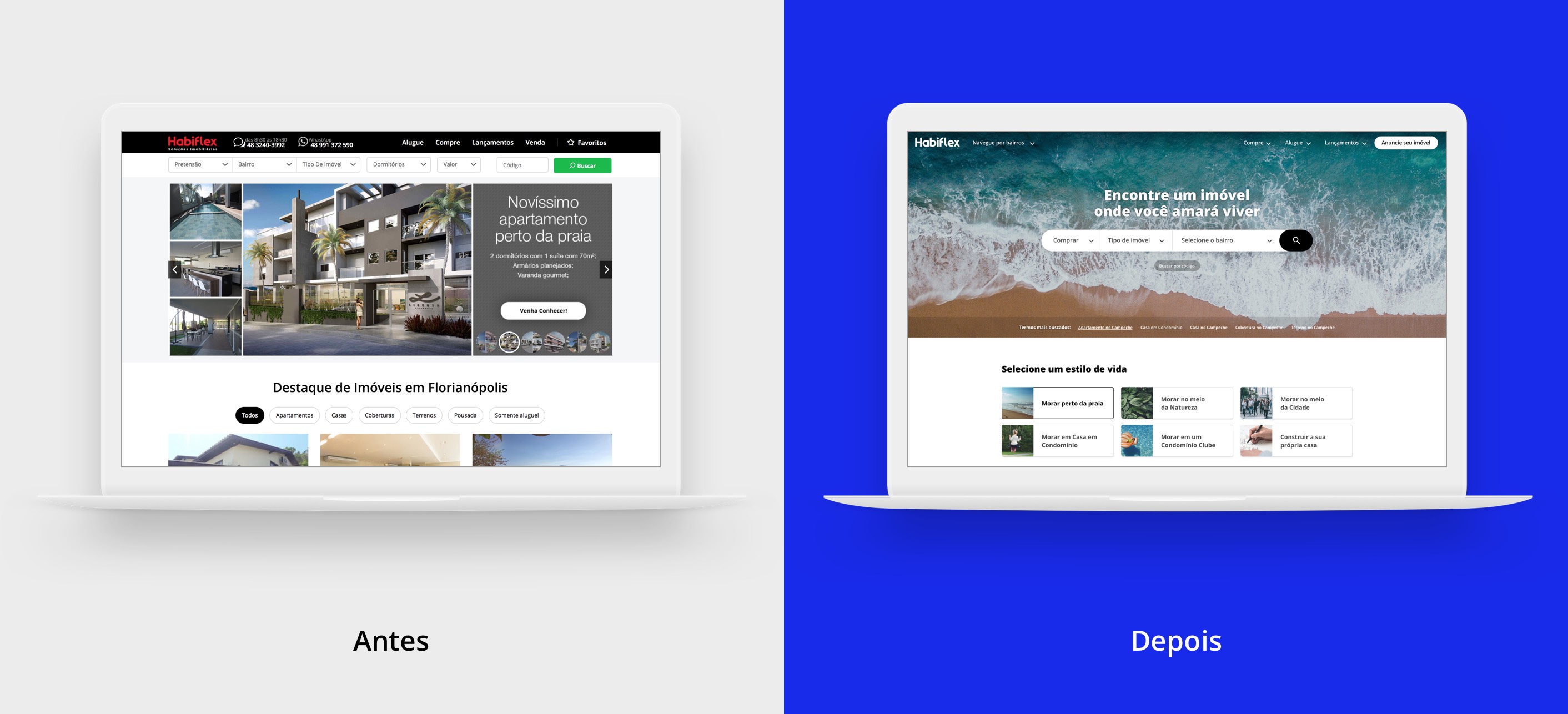
Homepage
In general, I have redesigned the entire main page. I tried to avoid too much information at once and separated the page into 3 main categories: discovery, search and artificial intelligence (based on the user’s browsing history).
In search filters, I have changed the number of fields from 5 to only 3 to decrease the user’s steps in doing a search.
Subtitle:
1- Neighborhood Guide (Discovery)
2- Search field (search)
3-Most searched terms (search)
4- Grouping properties by lifestyle (discovery)
5- Offer of new properties (discovery)
6, 7, and 8- Segmentation of properties by search history of the user that identifies: type of property, value range, characteristic. (AI)
9- Institutional (discovery)
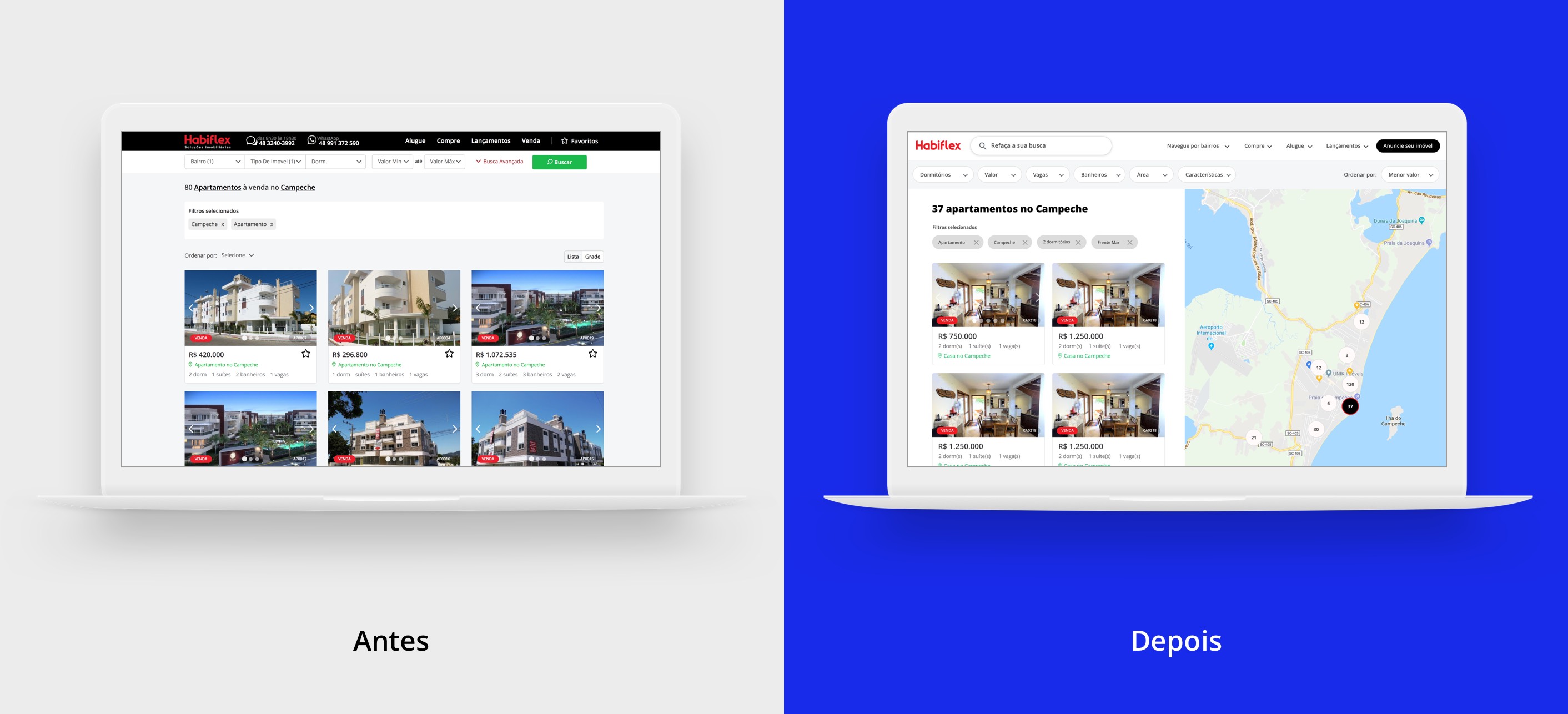
Search result page (properties listing)
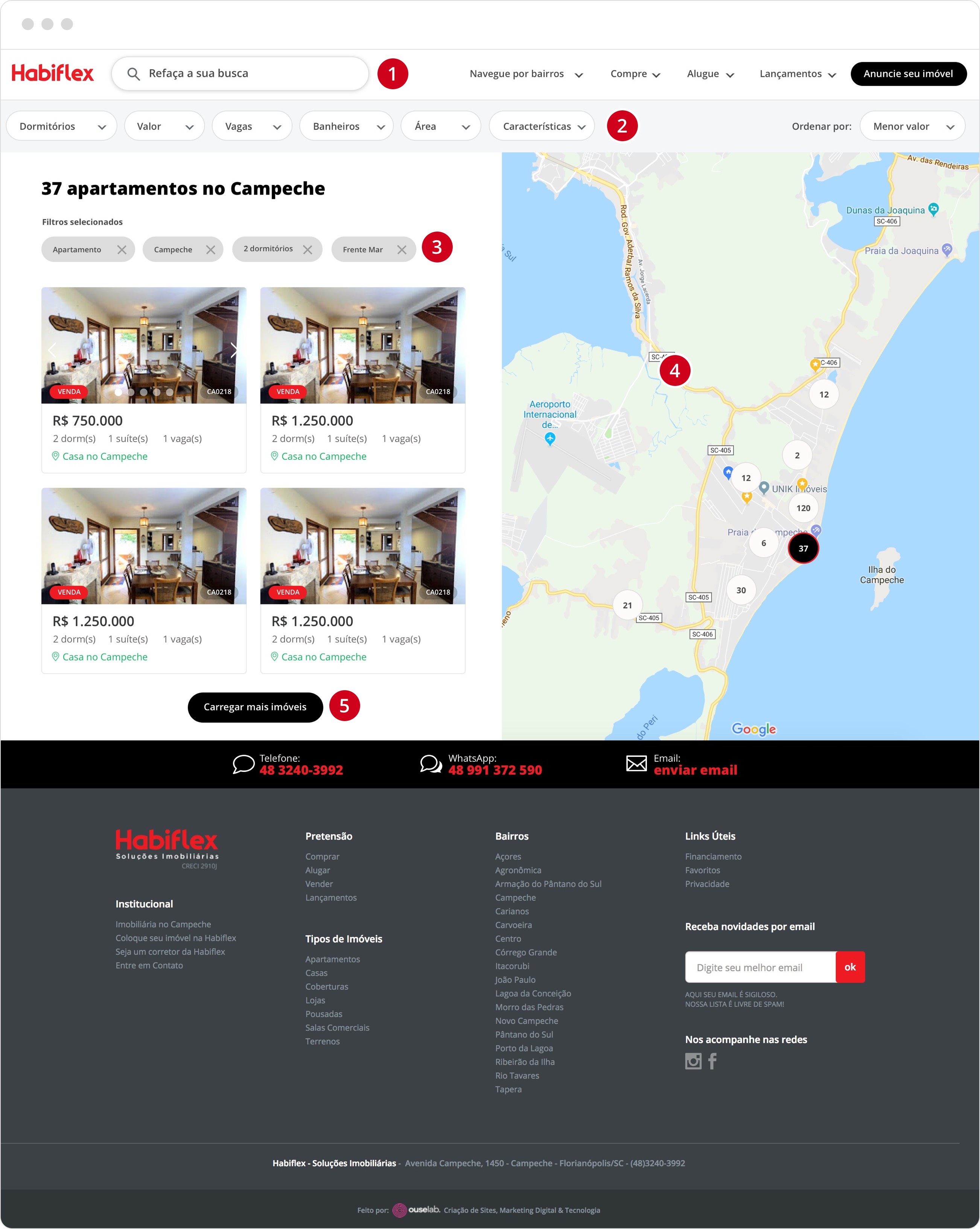
In this page I tried to make visible some search filters that were hidden in the button “advanced search” and included the option of the visualization by map.
Subtitle:
1- Search field always visible;
2 – Search filters;
3- Filters already selected;
4- Map of the location of properties;
5- Page with infinite scroll;
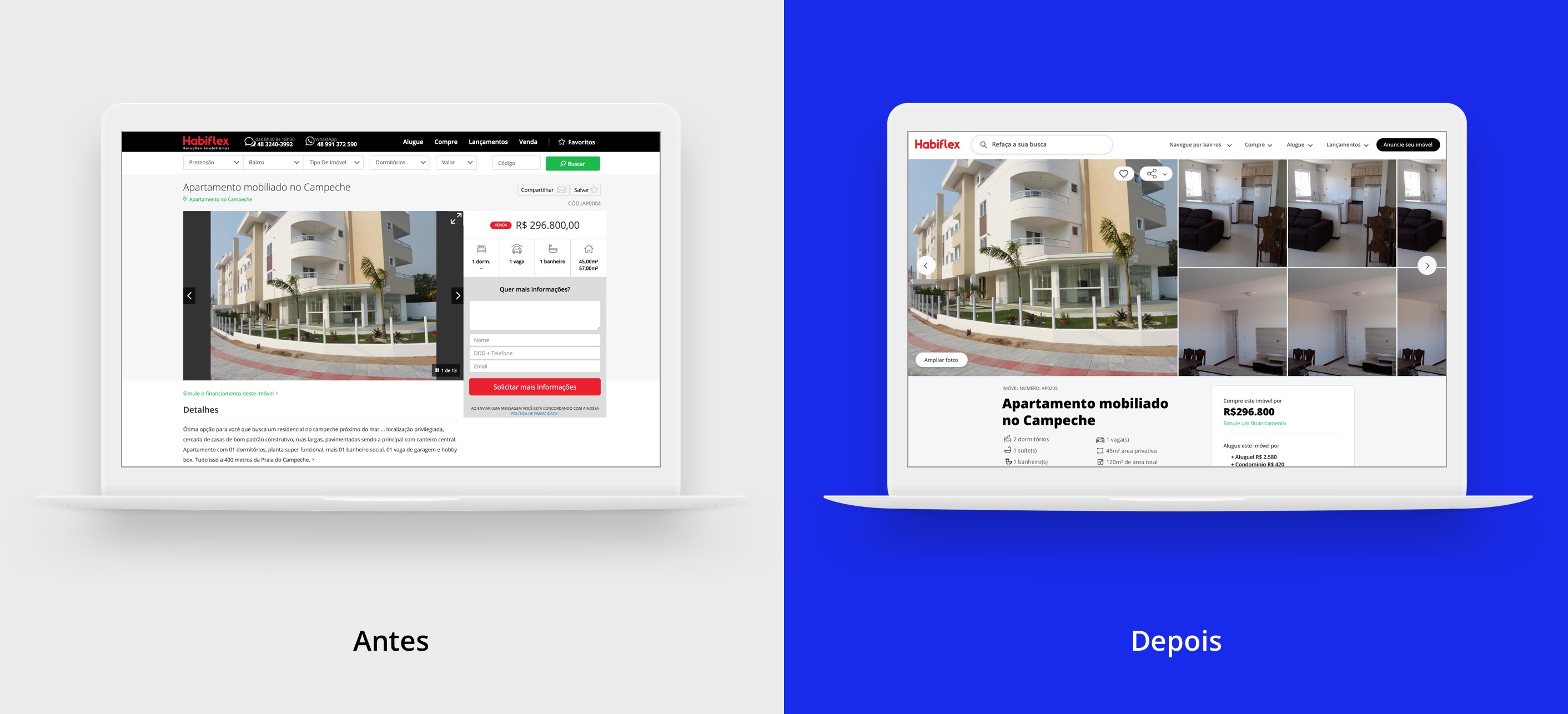
Property Detail Page
In this page, the main information is the images of the property, characteristics and contact form. I have refined these 3 sections to better align with the clearest and cleanest visual style.
I put all the necessary information of different values and the total amount is presented as a total of the calculation between rent + all taxes (value of IPTU + condominium). I have inserted a link to the necessary documentation for the lease or a link to a loan calculator in case of sale value.
Subtitle:
1- Button to zoom the photos;
2- Slider with all the photos of the property;
3- Characteristics of the property;
4- Price information and contact form floating on the screen;
5- Description of Property

Conclusion
I would like to have more time to delve deeper into the research because although the number of people who responded to the survey was relevant, there is a lot of important data that was not captured and I needed to use my 5-year experience working with real estate companies to fill in the gaps.
Of course, a prototype in high definition would be very useful, but as I said above, I lacked time to accomplish this task. The internet has great solutions for listing websites mainly with the introduction of startups in the real estate market as the case of Airbnb and Fifth Floor (Brazilian Startup).
Thanks for reading my post to the end and if you have any comments to make, write below or send me an email to hello@kadu.eu
See this project in my portfolio page.